Related Articles


Major COVID-19 data websites record deaths largely by pulling from state death totals that are presented by "date-of-report" rather than "date-of-death."
Several popular websites that track COVID-19 deaths have lately shown increasing death rates throughout the United States, leading to worries that COVID fatalities will soon be skyrocketing. Yet provisional data from the Centers for Disease Control and Prevention indicate that the nationwide death rate has continued its months-long decline even amid illusory reports of spiking fatalities.
COVID data websites have become ubiquitous tools for media and laypersons alike since the pandemic began. Teams of data researchers, scientists and public health officials have contributed heavily over the past several months to sophisticated Internet operations at which COVID cases, deaths and trends are tabulated and mapped so that both average citizens and U.S. authorities can survey the course of the pandemic throughout the country.
Three sites in particular — the data-tracking website Worldometers, the COVID Tracking Project, and a tracker at the website of Johns Hopkins University — have become major reference points for pandemic analysis over the last several months. Journalists and health officials regularly refer to these sources in the belief that their coronavirus datasets are authoritative.
Yet all three practice a little-known but critical method of data-gathering that obscures the actual course of the pandemic in the United States, often giving Americans the impression of elevated or increasing COVID-19 death rates even after weeks of declining fatalities.
Date-of-death versus date-of-report
At issue is the way in which the websites record deaths. They do so largely by pulling from state death totals that are presented by "date-of-report" rather than "date-of-death."
The distinction, at least during a pandemic, is a critical one. Many local health authorities have been overwhelmed at times with high numbers of coronavirus deaths over short time periods, which — coupled with standard administrative delays — can mean that COVID-19 deaths take days, weeks or even longer to reach official state logs and from there data tracking sites.
Some states, such as Virginia, offer users the ability to see deaths by both the date they occurred and the date they were reported. Others offer only one or the other.
Yet the three major COVID tracking sites all tabulate deaths by date of report, without any option to see COVID-19 fatalities listed by when they actually occurred. This has led to all three sites graphing recent weeks of fatalities as if they were increasing — but more timely data from the CDC suggests that week-over-week numbers of provisional deaths have actually been falling.
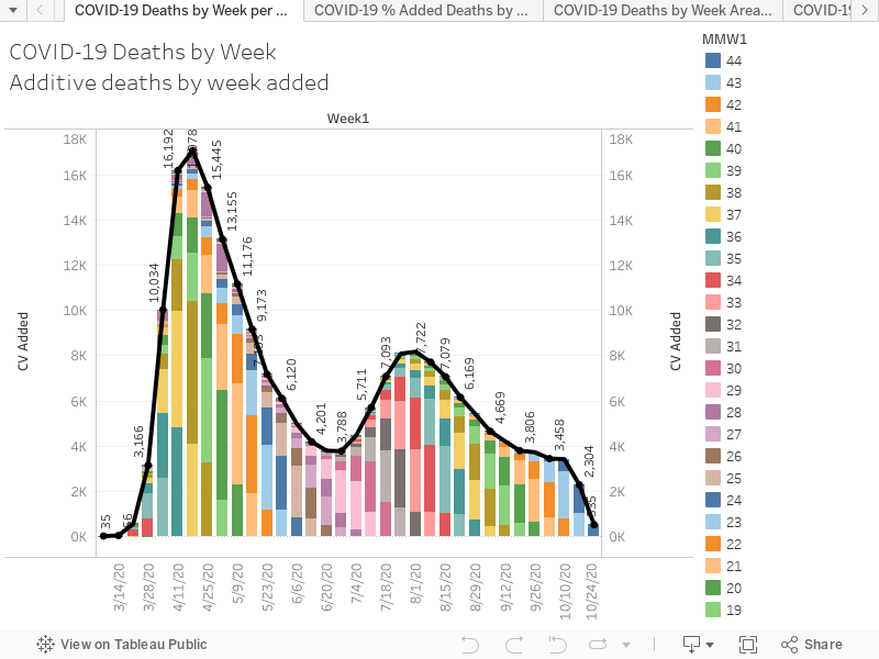
At the COVID Tracking Project, for instance, the data show the three-week period with weeks ending on Oct. 10, Oct. 17 and Oct. 24 had deaths increasing 4,420, 4,396, and 5,262, respectively. Worldometers listed those weeks as 4,755, 4,603, and 5,282. Johns Hopkins, meanwhile, pegged the deaths at 4,600, 4,700 and 5,300.
Those numbers have led to concerning media reports focused on the alleged rise. "Deaths per day from the coronavirus in the U.S. are on the rise again, just as health experts had feared," the Associated Press reported this week, citing Johns Hopkins. CNBC on Friday, also citing Johns Hopkins, alleged that the United States was averaging "800 deaths per day" from COVID.
Week-by-week data indicates marked decline
Yet provisional CDC data paints a starkly different picture: COVID-19 fatalities actually appear to be continuing a steady downward trend they've been on for months.
That data show that weekly COVID deaths in the U.S. appear to have peaked in early August and have been declining by hundreds of deaths per week every week since. Of the most recent three-week period that appears to show a rise in deaths per the popular websites, the CDC posts numbers that are both starkly lower and trending in the opposite direction from those listed by the other sites: from 3,635 at Oct. 10 to 2,841 the following week and finishing at 1,119 at Oct. 24.
Those numbers, of course, come with a caveat: They are, by design, "provisional," meaning they are subject to further updates as more deaths are logged. "Number of deaths reported in this table are the total number of deaths received and coded as of the date of analysis and do not represent all deaths that occurred in that period," the CDC states on the page.
Yet inflating current death counts with delayed death reports can distort what's known as the epidemiological curve, leading people — particularly policymakers — to misinterpret backdated deaths as a rising death rate.
Officials at the CDC, Johns Hopkins and Worldometers did not respond to requests for comment on their counting methods.
Erin Kissane, a content strategist and the general manager for the COVID Tracking Project, told Just the News that there are "a bunch of factors" going into the way various outlets catalogue deaths.
"Datasets using [date-of-death] dating schemes always show deaths declining in recent weeks, because many recent deaths haven't yet been reported," she said. "We report by date reported instead of date of death, which gives us more useful indicators a bit sooner, but also has downsides re: loss of precision in historical curves."
Kissane shared a July analysis by COVID Tracking Project data visualization co-leader Peter Walker in which he defended the project's date-of-report methodology. "While, ultimately, the date-of-death method will generate more precise statistics," he wrote, "public health officials and the public at large need the immediate and understandable view of trends that the date-of-report method provides."
Others, meanwhile, have figured out how to chart publicly reported deaths in ways that show the complex, confusing layers that the date-of-report method can create. The initiative Rational Ground — a project run by a broad collection of contributors including data analysts, writers, journalists and others — recently developed a data-intensive graph that charts COVID-19 deaths by spreading CDC-reported deaths onto past weeks to reflect the dates the deaths actually occurred.
Deaths added in one week "layer into the past like a blanket over a dateline," the initiative writes, creating a situation in which, for example, numerous deaths "added" last week are actually being pulled anywhere from the prior week to September to early April.
Alexis Madrigal, a staff writer at the Atlantic, said the COVID Tracking Project is currently developing a system to reflect the data in this way.
"We're actually working on this across cases and deaths — and it is very complicated," he told Just the News. "Like all the data collection we do, it's easy to do one time for one state, but it's hard to build systems that work across all the states every day."
"Our teams are very interested in doing it, though," he said, "and we've greenlighted the plan. They've started to build the technical infrastructure, but we're not publishing this data yet."
As of Saturday afternoon, the CDC stated that around 213,000 Americans have died from COVID-19.
var divElement = document.getElementById('viz1604169118568'); var vizElement = divElement.getElementsByTagName('object')[0]; vizElement.style.width='100%';vizElement.style.height=(divElement.offsetWidth*0.75)+'px'; var scriptElement = document.createElement('script'); scriptElement.src = 'https://public.tableau.com/javascripts/api/viz_v1.js'; vizElement.parentNode.insertBefore(scriptElement, vizElement);